design
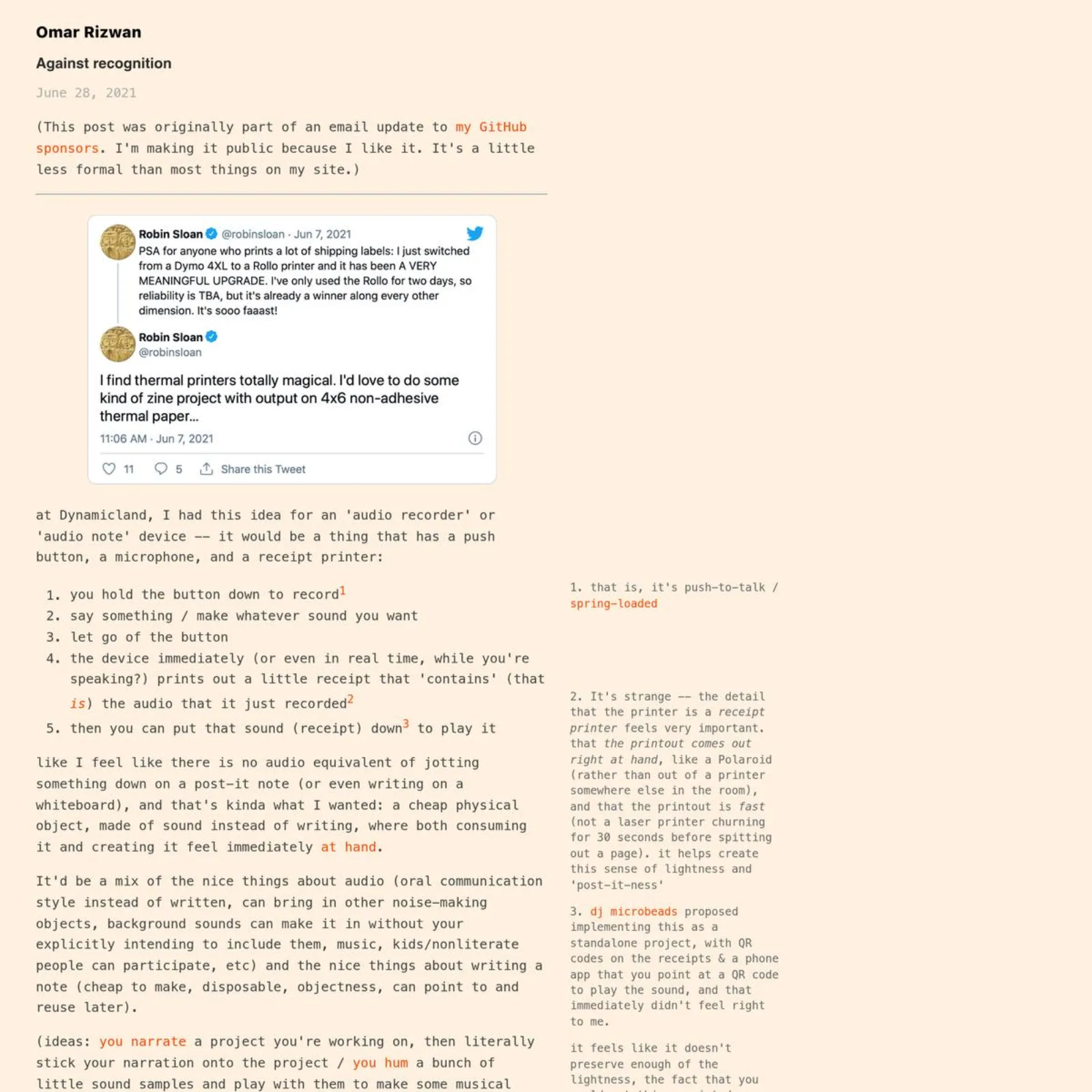
Against recognition
Against recognition
Post-it notes made of sound; the reMarkable tablet’s UI; a Dynamicland scrapbook
Brian Jacobson
Valve's Design Process for Creating Half-Life 2 https://youtu.be/wKsBsqdrqdU?si=OVcBzYG4pVz9lagi&t=1361
One example of an element in Half-Life 2 that damaged our game, was in Ravenholm we added the behavior where the phys-cannon could punt zombies which would cause them to flinch and do a little bit of damage, on the theory that more interaction was better.
What ended up happening was a bunch of our early playtesters, including Gabe [Newell], just ran around non-stop punting the zombies and completely missing the fact that they could pick up saw blades or propane canisters and use those, which were much more fun ways of killing zombies as we knew at the time since we'd already done those elements.
So as a result, we decided that element was hurting our game and removed it.
 judah@joodalooped
1) mobile gestures
a. double tap to open search
b. two finger tap to switch color mode
c. two finger hold to switch style
joodaloop.com/riffs/joodaloo…
judah@joodaloopedmakes it possible to quickly find a post since your eyes just have to focus on one spot while scrolling quickly
it’s a middle ground between collapsing every post by default (needs a click to open) and just showing full posts (hard to scan)
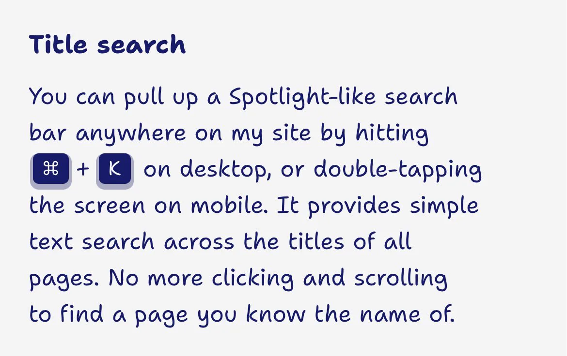
judah@joodaloopedi think they’re very cute, and they’re also wrapped in a <no-wrap> custom element that prevents them from breaking across new lines
(note that while the “K” uses the current active font, the Command symbol needs to fall back to the system font)
 judah@joodalooped
probably the most important feature — my site downloads itself to your browser and loads pages from there (immediately and in all network conditions)
internal links are styled differently than external ones to reflect this
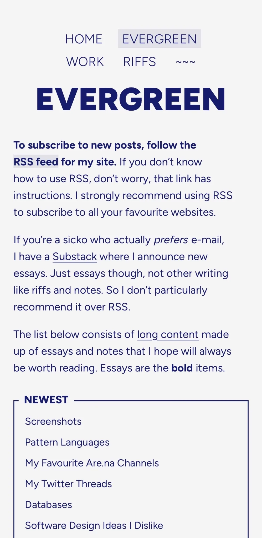
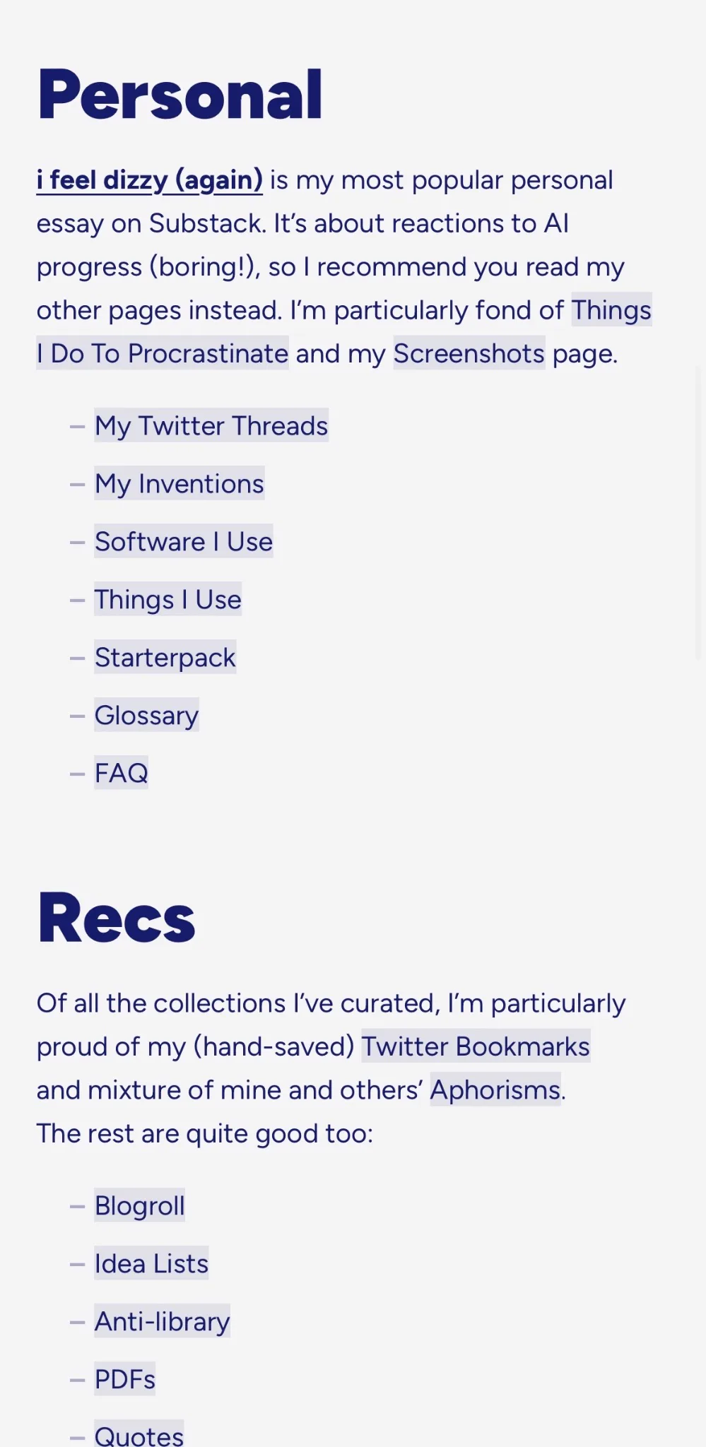
judah@joodaloopedit replaces my Writing page (since my site has more writing than just long-form and notes) and is one long hand-written document instead of a plain list of titles
so i can contextualise topics and posts however i like
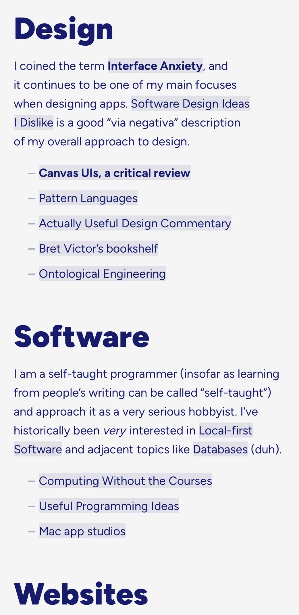
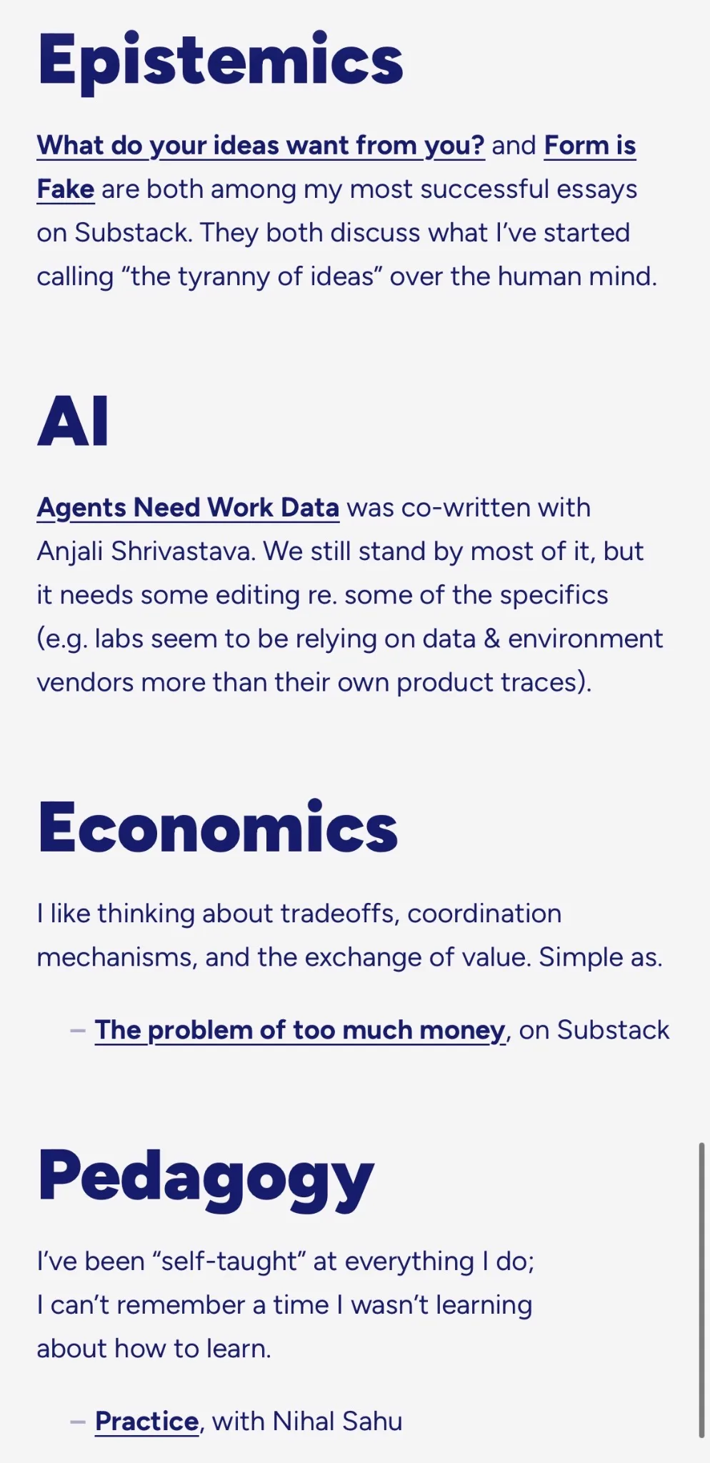
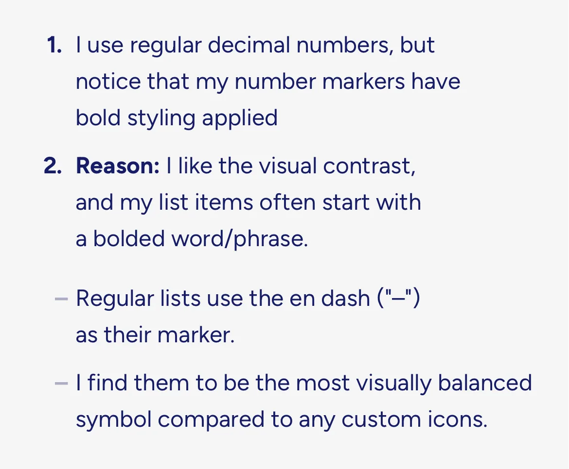 judah@joodalooped
when you switch the site to the handwritten style, page titles get a messier look
judah@joodaloopedevery post gets one, but i’m particularly proud of how it shows off the slug for the page, because i’m careful to pick short, memorable ones
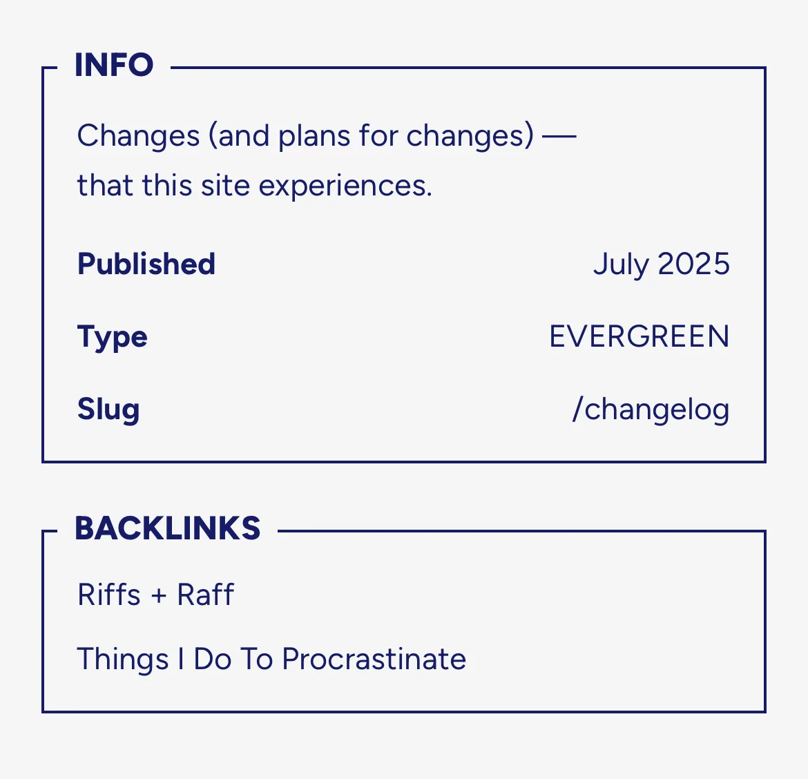
 judah@joodalooped
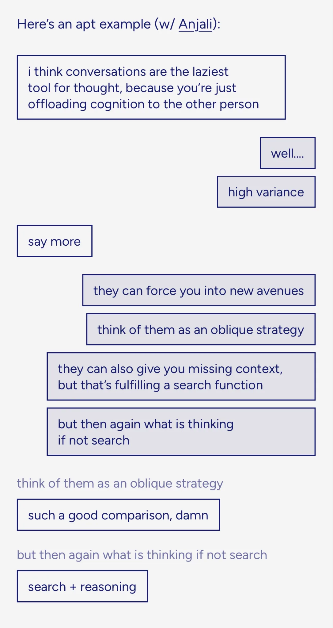
a custom design for representing conversations that happen as a series of short messages
 judah@joodalooped
you can click tweets to open them, but when you select text it doesn't open the tweet even thought you're pressing it with the mouse
so you can, yknow, actually copy the text
(1/N)
judah@joodaloopedso you can undo your selection or start re-selecting
and this works *across* tweets!
(2/N)
judah@joodaloopedthere's a tradeoff between "don't require a double click to open a tweet" and "clicking when there's selected text should always *only* unselect it"
(3/N)
judah@joodaloopedthis (and the detail in the next tweet) makes it feel like custom text selection of some kind? i'm not sure
(4/N)
judah@joodaloopedbrowser default is to select the text
and when i come back to the tweet i started on, it reads as a click on that tweet and opens it
(5/N)
judah@joodaloopedthis is how regular pages do it, the selection changes to include all text, moving your mouse then selects everything from the *top* of the page to your pointer
(6/N)
judah@joodalooped- custom text selection when within a tweet's text
- return control to the browser on Select All
- back to custom as soon the mouse moves within a tweet
(7/N)
judah@joodaloopedhere, it allows the bottom one to freely select *until* the mouse enters the top one, then it locks selection there
once it's locked, bringing the mouse back to the tweet it started on and releasing it...triggers a navigation click???
(8/N)
judah@joodaloopedhere i select text with the keyboard and it still unselects on click without opening the tweet
(9/N)
judah@joodaloopedif i select text and clock on it quickly, it counts as a navigation click instead of a deselect one
not sure if this is intentional or inherent slowness
(10/10)
 Linus@thesephist
Said another way, well-written code makes moving around in the program's design space efficient for the programmer.
Linus@thesephistLinus@thesephistLinus@thesephistLorusso, What Design Can't Do
“In a way, it is the very idea of design as an abstract and autonomous entity that is put into question: there is no Design, but designed artefacts, systems and processes, both material and immaterial; there are multiple influencing forces at play, and, in the middle of it all, there are designers, stuck between the grand project of modernity and the ‘smol’ tactics of everyday life.” (34–35)
“Who is more prone to this sentiment [of design disillusionment/disillusioning]? Design disillusion is the ‘feel’ of those who have access neither to the reassurance of the centre nor to the effervescence of the margin, those who feel stuck in some sort of pseudo-cultural, semi-professional suburbia.” (38–39)
“Specialisms have detached themselves from products to become a sort of shared attitude and a common set of cultural and methodological references. More than with the things that they do, designers identify with the sensitivity they adopt when they do those very things. To a certain extent, the contemporary designer is a designer without qualities.” (46)
“We need to relativise these notions [of who a designer is] to be able to see how, and if, they still lead to status. Excellence has always been the rhetorical instrument of a winning elite. But in order to understand elitist aspirations, we need to picture a kind of designer who is not so much part of an elite. This designer is not taken into account by design literature, which mostly focuses on promoting and strengthening the field. I will call this figure the everyday designer.” (48)
“While the image of the design star is intrinsically iconic, that of the everyday designer is admittedly rather blurry, but its function is clear: to avoid exceptionalism.” (50)
“Graphic design is a diluted practice, one in which professionals have to put increasing effort to assert their expertise to clients and society at large. Graphic design is where the necessity of radical openness becomes most obvious, since it’s also where the pro/amateur binary abruptly collapses. Graphic design, one of those “rather inchoate professions” in and around design, might even show the general trajectory of professions.” (51) “... I propose to see graphic design as the widest of the orders [as defined by design theorist Richard Buchanan in 1995, of which the other three are industrial, interaction, environment], as it is more affected by technical, cultural and methodological democratisation: it is spread more diffusely” (51) “across society” (52). “Marco Petroni argues that “[t]oo often in the world of design the harshness of the real is accepted only when translated or rendered imaginative.” ... Ultimately, design is terrified by what it is unable to change. It must systematically repress any manifestation of its impotence.” (63) — constant reinventions, redesigns of “design” itself, in pedagogy/education, in industry.
 Are.na@AREdotNA
we might not ever implement this ourselves (for...reasons) but that doesn't mean someone else can't!
let 1000 use cases bloom
jackie luo@jackiehluo
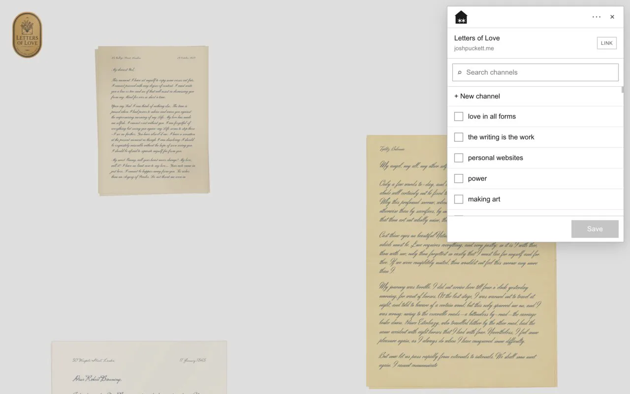
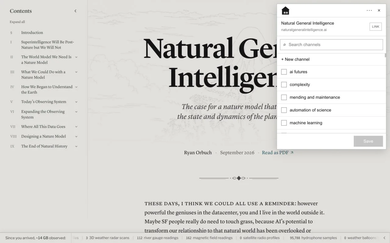
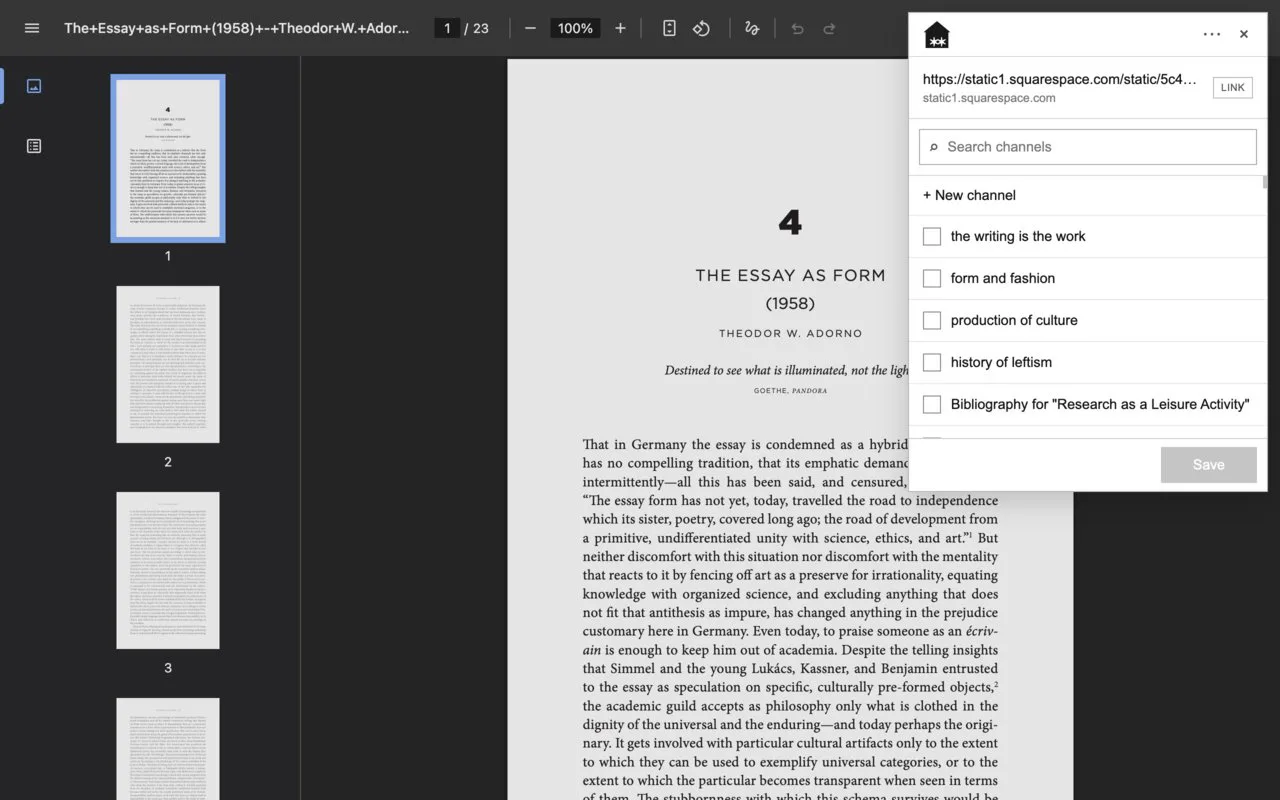
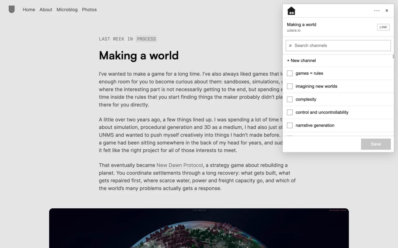
i made an @AREdotNA chrome extension that shows you the "likeliest homes" for the link you're saving
i have hundreds of channels and sometimes forget when i already made one for a topic or what i named it, so now @typesafeai shows good recs
to install: chromewebstore.google.com/detail/bdckhkf…
 Are.na@AREdotNA
observe the deep rabbit hole traversal and subsequent backing out of, all with each channel's scroll position maintained...
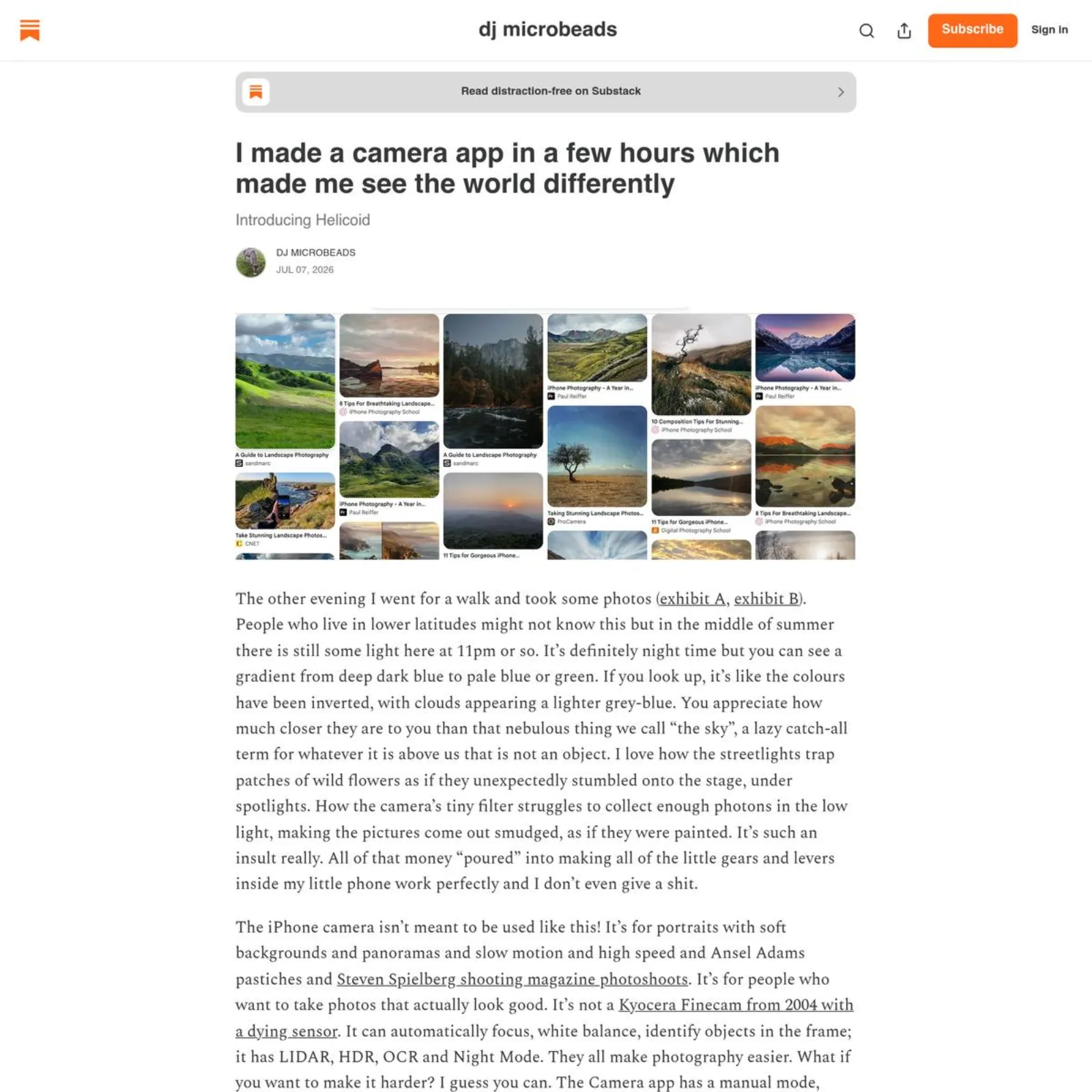
I made a camera app in a few hours which made me see the world differently
I made a camera app in a few hours which made me see the world differently
Introducing Helicoid